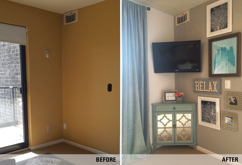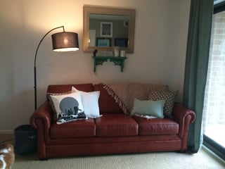
Canary yellow walls. A hand-me-down, brick red, leather couch. Limited floor space. What do these three things have in common? Collectively, they describe the catch-all space our “second bedroom” had become in our downtown Minneapolis condo.
By its previous owners, the room was used as a nursery. Despite the connected 16th floor balcony (I mean really, a baby? and a balcony?), this did made the most sense: The space was small and awkward, with barely enough room for a crib, let alone an adult-sized bed. With just the two of us and no plans to procreate in the foreseeable future, my husband and I decided on turning the space into the only other logical option: A media den.
A den’s a den. A media den, on the other hand -- well that’s built around one thing: A TV. In a small room with limited wall space and sliding glass doors, this posed a challenge. The largest wall would house our leather couch. Being made up of mostly doorway, the opposite wall had only one spot for our 42” TV, and mounted flush to the wall, glare from the sliding doors made it less than ideal. After a few failed furniture configurations and some research, we decided a SANUS full-motion mount was our best option, and we’d mount it in the corner of the room, opposite the couch. Having swivel capability, we could turn the TV away from the glass doors, achieving uninterrupted TV picture, no matter time of day.
Once the most important part of this transformation was complete - the TV was safely mounted and looking awesome - it was time to build the room around it; our goal being to create a cozy, comfortable space to sit back, relax, Netflix and chill.

First thing on the agenda? Those canary yellow walls. We opted for a more neutral scheme - white on three walls and and warm gray on one - awarding the brick red couch with the role of the color pop. As soon as the walls were painted and the couch was in place, the accent palette was strangely obvious: Blues and greens. We brought in a reclaimed wood coffee table, faux velvet drapes, lush pillows and the most perfect corner cabinet you ever did see. (Seriously - the cutest. My proudest furniture purchase yet. Can you believe those mirrored doors?)
With the furniture in place, the room was almost ready to enjoy. It looked like something out of a magazine! It was beautiful, but needed some personalization; some “us” massaged in. Inspired by a Pinterest post, I decided to integrate the mounted TV into a gallery wall. I hung a few of my favorite prints and photos in all different sizes and frames around the shape of the TV. The finished product was beautiful -- like a pro had done it!
With the help of a perfectly mounted TV, we had the space we needed to turn our awkward little “bedroom” into a cozy lounging nook. And it was all done within a weekend! Amazing!
Now, if you’ll excuse me, I have a very serious show binge to get back to in my new, beautiful media den. ;)
Topics: How To, TV Mount, Design, Full-Motion Mount

